
Most small business owners assume that packing their website with features, images, and information signals quality and professionalism. The reality is the opposite. Research consistently shows that simpler, cleaner websites outperform cluttered ones on every metric that matters: speed, trust, and sales. Whether you run a restaurant, a gym, or a barbershop, the way your website looks and functions directly affects how many visitors become paying customers. This article breaks down what clean web design actually means, why it works psychologically, and exactly how you can apply it to your own site starting today.
Table of Contents
- What makes a web design 'clean'?
- How clean design improves user experience and trust
- The science: Fewer choices, more conversions
- Practical steps for achieving clean design
- Why most businesses get clean design wrong and what you should do differently
- Build your high-converting website with our help
- Frequently asked questions
Key Takeaways
| Point | Details |
|---|---|
| Simplicity drives conversions | Fewer visual elements help visitors act faster and book more services. |
| Speed is essential | Minimalist websites load quickly, keeping users engaged and boosting SEO. |
| Psychology matters | Limiting choices on your site increases decision completion and customer satisfaction. |
| Branding stays unique | Clean design still allows your brand’s personality to shine while remaining easy to use. |
What makes a web design 'clean'?
With expectations set, let's get clear on exactly what makes a web design clean and why that matters for your business.
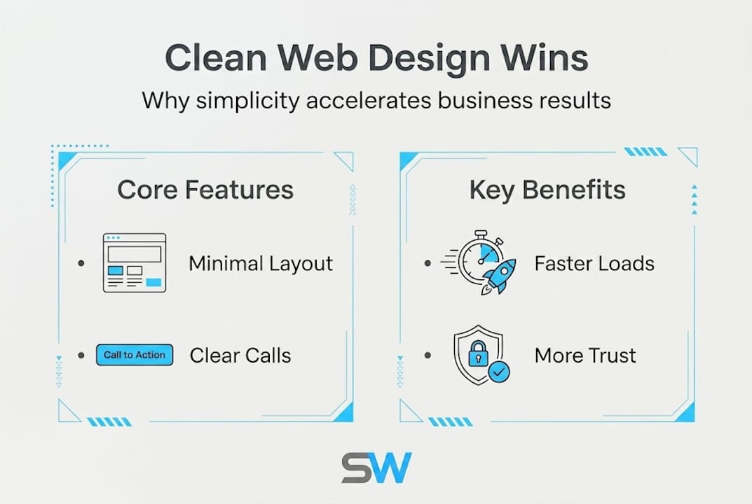
Clean web design is not about having an empty page. It means every element on your site has a clear purpose. Generous whitespace, simple navigation, and focused calls to action are the foundation. Nothing competes for attention. Visitors immediately understand what you offer and what to do next.
Think about a well-run restaurant. The menu does not list 200 items. It highlights the best dishes clearly so customers can order confidently. Your website works the same way. A fitness studio that leads with a single "Book a free class" button converts better than one with five different offers stacked on the homepage. A barbershop that shows its services, pricing, and a booking link above the fold gives customers everything they need without scrolling endlessly.
Here is a direct comparison of what clean versus cluttered websites look like in practice:
| Feature | Clean website | Cluttered website |
|---|---|---|
| Navigation items | 4 to 5 links | 10 or more links |
| Homepage calls to action | 1 primary button | 5 or more buttons |
| Font styles | 2 maximum | 4 or more |
| Images above the fold | 1 focused hero image | Multiple competing images |
| Pop-ups | None or minimal | Multiple on page load |
| Load time | Under 3 seconds | 5 seconds or more |
The benefits of clean design vary slightly by industry, but the core principles apply across food service, fitness, and personal grooming:
- Restaurants: A clean layout makes your menu scannable, your reservation button obvious, and your location easy to find.
- Gyms and fitness studios: Simple design highlights class schedules and membership options without overwhelming new visitors.
- Barbershops and salons: Clear service listings, pricing, and a single booking button reduce friction and drive appointments.
Real-world data backs this up. Simplification efforts have delivered impressive results across industries. For example, Dropbox saw +10% conversions, Crazy Egg improved conversions by 30%, and Mozilla increased downloads by 15.7% simply by removing clutter and focusing their pages.
A minimalist website approach does not mean stripping your brand of personality. It means making deliberate choices about what stays and what goes.
Pro Tip: The three most common clutter traps are auto-playing videos, pop-ups that appear within the first three seconds, and navigation menus with more than six items. Remove any of these from your site and you will immediately improve the visitor experience.
How clean design improves user experience and trust
Understanding the elements, it helps to see how clean design directly transforms your customers' experience and trust in your business.
Speed is the first thing clean design improves. Minimalist sites load faster because they use fewer scripts, fewer images, and less code. This directly reduces bounce rates, the percentage of visitors who leave without taking action, and boosts your ranking in Google search results through Core Web Vitals, Google's set of performance metrics.

Here is how load time affects conversion rates based on industry benchmarks:
| Page load time | Estimated conversion rate impact |
|---|---|
| 1 to 2 seconds | Highest conversion rate baseline |
| 3 seconds | 32% higher bounce rate than 1 second |
| 5 seconds | Up to 90% higher bounce rate |
| 7 or more seconds | Conversion rate drops significantly |
For a barbershop or restaurant, a slow site means a customer closes your page and books with a competitor who loaded faster. Speed is not a technical detail. It is a direct revenue issue.
Trust is the second major benefit. When a new visitor lands on your site, they form an opinion in less than a second. A clean, well-organized page signals that you are professional and reliable. A cluttered page, even if your business is excellent, creates doubt. The psychology of web design shows that visual complexity is directly linked to lower perceived credibility.
"When users encounter a cluttered website, they experience cognitive overload. The brain struggles to prioritize information, which leads to frustration and abandonment rather than action."
Usability improvements from clean design are practical and immediate. Consider these specific wins:
- Clear menus mean customers find what they need without guessing.
- Readable content with proper font sizes and spacing keeps visitors engaged longer.
- Accessible calls to action placed prominently guide visitors toward booking, ordering, or calling.
- Mobile responsiveness is easier to achieve and maintain on a clean layout, which matters because most local business searches happen on phones.
For a gym, this could mean a visitor lands on your page, immediately sees "Join for $30 a month," clicks the sign-up button, and completes the form in under two minutes. No confusion. No searching. Just a smooth path to becoming a member.
The science: Fewer choices, more conversions
Trust and usability are just part of the puzzle. The science shows us why less really is more when it comes to converting visitors into paying customers.
The Hick-Hyman Law is a psychological principle that states the more choices a person faces, the longer it takes them to make a decision. On a website, longer decision time usually means the visitor leaves without acting. Cluttered sites cause decision paralysis through this exact mechanism. Too many buttons, links, and options overwhelm the brain, and the easiest response is to do nothing.
The paradox of choice reinforces this. Psychologist Barry Schwartz demonstrated that offering more options does not make people happier or more likely to buy. It makes them anxious and less likely to commit. Your website is no different from a store shelf with 40 varieties of jam. Fewer, better options lead to more sales.
Here is how the process plays out step by step for a typical small business website visitor:
- Visitor arrives on a cluttered homepage with 8 navigation links, 3 pop-ups, and 6 different calls to action.
- Brain overloads trying to figure out where to look first.
- Frustration builds within the first 5 to 10 seconds.
- Visitor bounces and searches for a competitor with a clearer site.
Now compare that to a clean experience:
- Visitor arrives on a focused homepage with one hero image, a clear headline, and a single "Book now" button.
- Brain processes the information instantly.
- Visitor clicks the button with confidence.
- Booking is completed in under two minutes.
The data confirms this pattern. Landing pages with fewer than 10 elements convert at 2.17 times the rate of pages with 40 or more elements. That is not a small improvement. That is more than double the results from the same traffic.
Real-world examples make this concrete. A barbershop that offers one booking option, "Pick your barber and choose a time," converts better than one that asks visitors to choose between five different service packages, three add-ons, and a membership plan before they can even book. A fitness studio that shows a single "Start your free trial" button on the homepage outperforms one that lists every class type, pricing tier, and instructor bio on the first screen.
Pro Tip: On your most important pages, such as your booking page, contact page, or service menu, limit visible choices to three or fewer. If you have more options, use a simple dropdown or tabbed layout to keep the page clean while still offering variety.
Practical steps for achieving clean design
Now that you know why simplicity drives results, it is time to put theory into practice on your own site.
Start with a quick self-audit. Open your website on your phone, because that is how most of your customers see it. Ask yourself these questions honestly: Can I find the most important action in under five seconds? Is there anything on this page I could remove without losing value? Does every section have a clear purpose?
Most business owners find at least three to five elements they can remove immediately. Common culprits include outdated news sections, social media feeds that load slowly, excessive stock photos, and navigation links to pages that barely get any traffic.
Here is a numbered checklist to guide your cleanup:
- Reduce navigation links to five or fewer. Keep only the pages that matter most: Home, Services, About, Contact, and one conversion page like Book or Order.
- Remove all auto-playing media. Videos and music that start automatically frustrate visitors and slow your site.
- Cut pop-ups or delay them to at least 30 seconds after page load, and make them easy to close.
- Use one primary call to action per page. Every page should have one clear next step.
- Standardize your fonts. Use a maximum of two font styles across your entire site.
- Compress all images before uploading. Large image files are one of the biggest causes of slow load times.
- Audit your homepage and remove anything that does not directly support your main conversion goal.
Every one of these steps supports faster load times, which reduces bounce rates and boosts SEO through Google's Core Web Vitals scoring system.
Essential features every service business needs above the fold, meaning visible without scrolling, include:
- Your business name and a clear one-line description of what you offer
- A single, high-quality image that represents your brand
- One primary call to action button
- Your phone number or location if you are a local business
When you are ready to go beyond a quick fix, partnering with a web professional who understands clean design for your industry makes a significant difference. Look for designers who show you examples from restaurants, gyms, or barbershops, not just tech companies. Ask to see custom website solutions built specifically for service businesses. The right partner will prioritize your conversion goals, not just aesthetics.
Why most businesses get clean design wrong and what you should do differently
Here is something I see constantly: business owners hear "clean design" and immediately think it means a white page with minimal branding. They strip out their personality, remove their logo colors, and end up with a site that looks like every other generic template online. That is not clean design. That is bland design, and it does not convert either.
Clean design is focused storytelling, not emptiness. Your brand has a personality. A neighborhood barbershop should feel warm and confident. A high-energy gym should feel motivating. A family restaurant should feel welcoming. Clean design means you deliver that feeling instantly, without clutter getting in the way.
The businesses that get this right treat every design choice as a question: does this element help my customer take action, or does it distract them? That single question filters out 80% of the clutter. What remains is a site that feels both minimal and distinctly yours.
The most effective small business websites I have built combine a tight layout with strong brand identity. Bold colors used intentionally. One great photo instead of a gallery of ten average ones. A headline that speaks directly to the customer's need. That combination of simplicity and personality is what actually drives bookings, orders, and calls.
Build your high-converting website with our help
If you are ready to stop losing customers to a cluttered, slow website, the next step is straightforward.
I build custom websites for small businesses in food service, fitness, and personal grooming, designed from the ground up with clean, high-converting layouts. Every site I create is mobile-responsive, fast-loading, and built around your specific conversion goals, whether that is filling your booking calendar, driving online orders, or growing your membership base. Sites go live within 24 hours, come with unlimited revisions, and include ongoing support so you are never left figuring things out alone. If you want a website that actually works as hard as you do, let's talk.
Frequently asked questions
What are the main benefits of clean web design for my small business?
Clean designs load faster and boost conversions, making it easier for customers to find what they need and take action, which directly increases bookings, orders, and revenue.
Does clean design mean my site will look plain or boring?
No. Clean design focuses on simplicity and usability while keeping your brand's unique colors, voice, and personality front and center, so your site stands out without overwhelming visitors.
How many elements should my homepage include?
Pages with fewer than 10 elements convert at more than twice the rate of crowded pages, so keeping your homepage focused and lean is one of the highest-impact changes you can make.
How can I tell if my current website is too cluttered?
If visitors struggle to find key information quickly, or your site has multiple pop-ups, long navigation menus, and competing buttons, you are likely experiencing the decision paralysis effect that drives customers away before they act.