
Picture this: a potential customer finds your restaurant, gym, or barbershop on Google, taps your website link, and gets a jumbled mess of tiny text and broken images on their phone. They close the tab and book with your competitor instead. This happens every day to local businesses running outdated, non-responsive websites. The good news? A clear, repeatable responsive website workflow fixes this problem fast. In this guide, I'll walk you through every step, from the tools you need to launch day, so you can build a site that works beautifully on every screen and keeps customers coming back.
Table of Contents
- What you need to start: Tools, requirements, and mindset
- Step-by-step responsive website workflow
- Troubleshooting: Common mistakes and advanced solutions
- Testing and launch: Verify responsiveness and optimize for customer results
- A fresh perspective: Why small businesses should rethink their website workflow
- Take your next step: Affordable responsive websites for local businesses
- Frequently asked questions
Key Takeaways
| Point | Details |
|---|---|
| Mobile-first workflow | Starting with mobile layout yields better site performance and customer satisfaction. |
| Tools and mindset | The right tools and a customer-focused mindset set you up for responsive design success. |
| Practical troubleshooting | Learning to fix common layout issues saves time and prevents customer frustration. |
| Real device testing | Testing on actual phones and tablets ensures your site works for real customers. |
| Expert help available | Affordable services can help you launch and maintain a responsive web presence. |
What you need to start: Tools, requirements, and mindset
Before writing a single line of code or clicking a single button in your website builder, you need the right setup. Most small business owners overcomplicate this stage. They assume responsive design requires a developer, expensive software, or months of learning. It doesn't. What it requires is the right tools, a clear plan, and the right mindset.
The single biggest misconception I see is starting with desktop design first. That approach made sense in 2010. Today, mobile-first design means you design and code for the smallest screens first, then enhance for larger viewports using min-width media queries. This keeps your site lean, fast, and customer-ready from day one.
Here's what you actually need to get started:
- Hosting and domain: Choose a reliable host like SiteGround, Bluehost, or Cloudflare Pages. Your domain should match your business name closely.
- Website builder or CMS: WordPress, Webflow, or Squarespace all support responsive design. For food service, fitness, and grooming businesses, WordPress with a lightweight theme is often the best balance of flexibility and affordability.
- A real mobile device for testing: Browser simulators are helpful but not enough. You need an actual phone to catch real-world issues.
- Basic layout knowledge: You don't need to code, but understanding rows, columns, and spacing helps you make smarter decisions in any builder.
- Access to responsive design basics: Bookmark this reference. It explains how layouts adapt across screen sizes in plain language.
The mindset shift matters just as much as the tools. Stop asking "Does this look good on my laptop?" and start asking "Can my customer book a table or class from their phone in under 30 seconds?" That question drives every good design decision.
Pro Tip: Before touching any design tool, write down the three actions you want mobile visitors to take. For a barbershop, that might be: view services, see pricing, and book an appointment. Design your mobile layout around those three actions first.
Here's a quick overview of what each tool handles:
| Tool | Purpose | Cost range |
|---|---|---|
| WordPress | CMS and content management | Free (hosting extra) |
| Webflow | Visual responsive design | $14 to $39/month |
| Squarespace | All-in-one builder | $16 to $49/month |
| Chrome DevTools | Browser-based layout testing | Free |
| Real mobile device | Authentic user testing | Device you already own |
For a deeper look at how I approach small business web design, the core principle is always the same: start simple, prioritize the customer, and build from there.
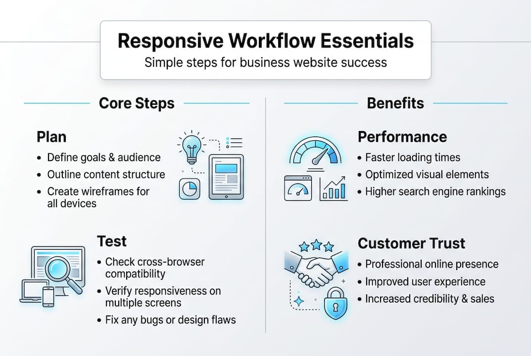
Step-by-step responsive website workflow
After assembling your tools and mindset, you're ready to follow the workflow that creates a website customers love using on any device. Here's the sequence I use for every local business site I build.
- Map your content for mobile first. List every page and every element: your menu, booking form, service list, photo gallery. Rank them by importance to a mobile visitor. Cut anything that isn't essential on small screens.
- Build your base layout using intrinsic responsiveness. Before reaching for media queries, use CSS Grid with "auto-fit
andminmax()`. This approach, part of what experts call escalating responsiveness, means your layout adapts naturally without extra code. Intrinsic design first, container queries second, media queries last. - Add container queries for component-level control. Container queries let individual components, like a booking card or a menu item, respond to their own container size rather than the whole viewport. This is especially useful for gym class schedules or barbershop service cards.
- Apply min-width media queries for major breakpoints. Once intrinsic design handles the heavy lifting, add mobile-first workflow breakpoints at 640px, 768px, and 1024px to fine-tune tablet and desktop layouts.
- Test at every step. Don't wait until the end. After each layout change, check it on your phone.
- Optimize images and fonts. Large images are the top cause of slow mobile load times. Use WebP format and lazy loading. Limit font families to two.
Here's how traditional and modern approaches compare:
| Approach | How it works | Best for |
|---|---|---|
| Traditional media queries | Viewport-based breakpoints | Simple layouts, older browsers |
| Container queries | Component-based responsiveness | Reusable cards, modular sections |
| Intrinsic design (Grid auto-fit) | Content-driven natural flow | Galleries, service grids, menus |
Pro Tip: Use a custom website workflow checklist for your specific industry. A fitness studio needs a class schedule component. A restaurant needs a mobile-friendly menu. Build those components first, then wrap the rest of the site around them.
This sequence removes guesswork. Each step builds on the last, and you always know exactly where you are in the process.

Troubleshooting: Common mistakes and advanced solutions
Once you've established your workflow, it's crucial to recognize and address common pitfalls so your site delivers consistent quality. Even experienced designers run into these issues. Knowing them ahead of time saves you hours of frustration.
The most common mistakes small business owners make:
- Skipping mobile-first design: Starting with the desktop layout and trying to shrink it down creates bloated, slow mobile pages.
- Only testing in browser dev tools: Simulators miss real-world rendering issues. Always test on a physical device.
- Overloading the page with features: Sliders, animations, pop-ups, and video backgrounds all hurt mobile performance. Keep it clean.
- Ignoring accessibility: If your text contrast is too low or your buttons are too small to tap, you're losing customers with accessibility needs.
- Forgetting to check responsive workflow challenges: Every industry has specific layout needs. A grooming business needs a clear booking button above the fold. A food service site needs a tap-to-call button.
One of the trickiest technical problems is stacking context conflicts. Here's what that means in plain language: when you use CSS properties like transform, opacity, or position: fixed, they create a new stacking layer. This can cause modals (pop-up windows) to appear behind other elements, or overlapping content to display in the wrong order on mobile.
"Stacking contexts interfere with z-index, such as modals appearing behind other elements. Fix this by restructuring your HTML or adjusting the parent element's z-index. Container queries solve component-level responsiveness without needing to know the viewport size."
For low-budget projects, the fix is almost always simplification. Remove the feature causing the conflict rather than engineering around it. A clean, fast site with a working booking form beats a flashy site with broken modals every single time. Focus on what your customer needs to do, not what looks impressive in a demo.
Always run a quick accessibility check before launch. Tools like WAVE or Lighthouse (built into Chrome) flag issues like missing alt text, low color contrast, and unlabeled form fields. These fixes take minutes and make your site usable for more people.
Testing and launch: Verify responsiveness and optimize for customer results
Solving mistakes puts you on track, but testing assures your site delivers results and builds customer trust. This stage is where most small business owners rush, and it's where the biggest customer-facing errors slip through.
Here's the testing sequence I follow before every launch:
- Test on real phones and tablets. Hand your phone to a friend or family member who doesn't know the site. Watch where they tap, where they hesitate, and what confuses them. That feedback is worth more than any analytics tool.
- Check Core Web Vitals. Google measures three key performance signals: LCP (Largest Contentful Paint, how fast the main content loads), INP (Interaction to Next Paint, how quickly the page responds to taps), and CLS (Cumulative Layout Shift, whether elements jump around while loading). Core Web Vitals directly affect your Google ranking.
- Verify Google mobile-first indexing compatibility. Google indexes and ranks the mobile version of your site first. If your mobile layout is missing content that your desktop version has, you'll rank lower.
- Run a cross-browser check. Test in Chrome, Safari, and Firefox on both iOS and Android. Safari on iPhone is especially known for rendering differences.
- Review your launch checklist. Use a responsive launch checklist that covers: contact info visible on mobile, booking or reservation system working, images loading fast, and call-to-action buttons easy to tap.
Key stat: Mobile-first design consistently outperforms desktop-first approaches in both performance scores and SEO rankings, making it the clear standard for any new small business website in 2026.
Pro Tip: After launch, send a short text or email to your five best customers asking them to visit your new site on their phone and share one piece of feedback. Real customer input catches issues no test can replicate.
Post-launch, treat your site as a living tool. Update your menu, class schedule, or service list regularly. Add photos from real customers with their permission. A site that stays current keeps visitors coming back and signals to Google that your business is active.
A fresh perspective: Why small businesses should rethink their website workflow
Here's something most web design guides won't tell you: the biggest threat to your website's success isn't bad design. It's over-engineering. I've seen small business owners spend thousands on complex animations, custom-coded sliders, and multi-step booking systems that confuse customers and slow down pages.
The businesses that win online are the ones that keep it simple. A fast-loading page with a clear headline, a tap-to-call button, and a working reservation form will outperform a visually stunning site with slow load times every single time. Escalating responsiveness, starting with intrinsic design and only adding complexity when needed, is the technical version of this philosophy.
Customer experience is your ROI. Every second of load time you cut, every extra tap you remove from the booking process, translates directly into more appointments booked and more orders placed. The workflow in this guide isn't just a technical process. It's a business strategy.
For local business sites, the most effective approach is always the one your customer can use without thinking. Simple, fast, and focused beats complex every time.
Take your next step: Affordable responsive websites for local businesses
You now have a clear, actionable workflow to build a mobile-ready website that works for your customers and your bottom line. But knowing the steps and executing them perfectly are two different things.
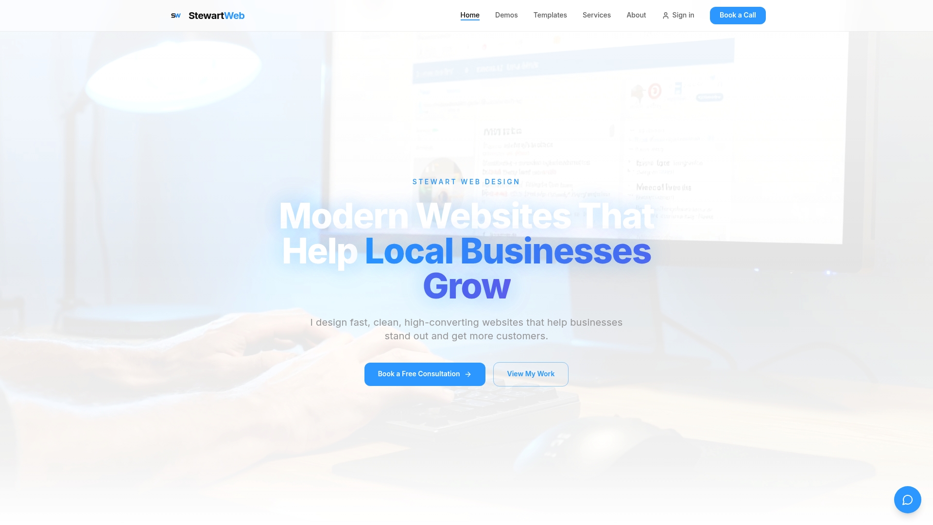
At Stewart Web Design, I build fast, clean, high-converting websites for food service, fitness, and grooming businesses, typically launched within 24 hours. Whether you run a barbershop, a gym, or a restaurant, I'll handle the responsive workflow so you can focus on running your business. Every site includes unlimited revisions and ongoing support. Ready to start your responsive website and stop losing customers to a broken mobile experience? Let's build something great together.
Frequently asked questions
What is a responsive website workflow?
It's a step-by-step process that ensures a website works seamlessly on all devices. Mobile-first design means you design and code for the smallest screens first, then enhance for larger viewports.
Why should small business sites use mobile-first design?
Most customers visit local business websites from their phones, and mobile-first design improves site performance, SEO rankings, and customer engagement compared to desktop-first approaches.
How do you test a responsive website?
Test on real devices and multiple browsers, then check Core Web Vitals including LCP, INP, and CLS, and confirm compatibility with Google mobile-first indexing.
What are common mistakes in responsive workflow?
Ignoring mobile-first design, only testing in browser simulators, and using overly complex code are the top mistakes. Stacking context issues with z-index can also break layouts on mobile if left unaddressed.