
A beautiful website that nobody acts on is just expensive decoration. Many service business owners pour time and money into stunning visuals, only to watch visitors leave without booking, calling, or filling out a form. The uncomfortable truth is that pretty designs convert under 2%, while clarity-focused sites regularly hit 8-12%. This guide breaks down exactly what high conversion web design means, which frameworks actually move the needle, and how you can apply these principles to your service business starting today.
Table of Contents
- Defining high conversion web design: What really works
- Key elements driving conversions: Methodologies and frameworks
- Expert nuances and advanced tactics: What most miss
- Applying high conversion design: Service business scenarios
- Our take: Why incremental clarity trumps massive redesigns
- Transform your service website with high-conversion design
- Frequently asked questions
Key Takeaways
| Point | Details |
|---|---|
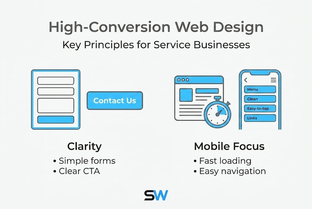
| Clarity drives conversions | Simple, clarity-focused designs outperform aesthetics for service business websites. |
| Fewer form fields boost results | Limiting forms to three or four fields significantly lifts conversion rates. |
| Mobile-first is essential | Optimizing for mobile prevents friction and keeps customers engaged. |
| Incremental changes compound | Small clarity-focused tweaks deliver better ROI than big redesigns. |
Defining high conversion web design: What really works
Now that we've identified why clarity matters more than aesthetics, let's define the core principles of high conversion web design.
High conversion web design is not about making a site look impressive. It's about guiding visitors toward one specific action, as efficiently as possible. Every design decision, from button color to headline placement, should serve that goal. When you treat your website as a sales tool rather than a portfolio piece, everything changes.
The core methodologies behind conversion-focused design include four non-negotiable pillars:
- One primary conversion goal per page. Each page should push visitors toward a single action, whether that's booking an appointment, calling your number, or submitting a contact form. Multiple competing goals create confusion and inaction.
- Visual hierarchy. Visitors scan pages in predictable F-shape or Z-shape patterns. Your headline, value statement, and call-to-action (CTA) button must sit in those natural eye paths. If your CTA is buried below the fold, you're losing conversions before the visitor even reads your offer.
- Mobile-first design. More than half of all web traffic comes from mobile devices. If your site isn't built with mobile users in mind first, you're designing for the minority and frustrating the majority.
- Iterative A/B testing. High conversion design is never finished. Conversion-focused methodologies treat the website as a living experiment, constantly testing headlines, button text, and layouts to find what performs best.
"Design is not just what it looks like and feels like. Design is how it works." This principle is at the heart of every high-converting service website.
Here's a quick comparison that shows the difference between a pretty site and a high-converting one:
| Feature | Aesthetic-focused site | Conversion-focused site |
|---|---|---|
| Primary goal | Visual impact | Drive a specific action |
| Navigation | Many menu options | Streamlined, minimal links |
| CTA placement | Scattered or below fold | Above fold, repeated strategically |
| Trust signals | Footer logos | Inline, contextual placement |
| Mobile experience | Adapted after desktop | Built mobile-first |
| Conversion rate | Under 2% | 8-12% or higher |
The difference is stark. A service business in fitness, food, or personal grooming cannot afford to leave conversions on the table because the site looks nice but doesn't guide visitors to act. Clarity, simplicity, and strategic structure are the real drivers of results.

Key elements driving conversions: Methodologies and frameworks
With a solid definition in place, let's break down the methodologies and frameworks that reliably boost conversions.
Every service business website has high-impact elements that can be optimized right now. The good news is that you don't need a complete redesign to see major gains. Small, targeted changes to the right elements can dramatically shift your conversion rate.
Here are the four most proven frameworks, ranked by impact:
-
Simplify your forms. This is the single highest-leverage change most service sites can make. Reducing form fields to 3-4 can lift conversions by 50% or more. Think about it from your customer's perspective. If someone wants to book a haircut and you're asking for their address, birthday, and preferred stylist biography, they'll abandon the form. Ask for name, phone number, preferred date, and service type. That's it. Keep the friction low.
-
Use high-contrast, action-oriented CTAs. Your call-to-action button needs to stand out visually and tell the visitor exactly what happens next. "Book your free consultation" outperforms "Submit" every single time. Use a color that contrasts sharply with your background, make the button large enough to tap on a phone screen, and place it where the eye naturally lands.
-
Run A/B tests on high-impact elements. Don't guess what works. Test your headline, your CTA button text, and your hero image against alternatives. Run each test for at least two weeks to gather meaningful data. Even a 10% improvement in CTA click-through rate compounds into significant revenue over a year.
-
Design for thumbs, not mouse cursors. On mobile, users navigate with their thumbs. Buttons need to be at least 44 pixels tall and spaced apart so taps don't accidentally hit the wrong element. Navigation menus should collapse cleanly, and key actions should sit within easy thumb reach in the lower portion of the screen.
| Element | Low-converting version | High-converting version |
|---|---|---|
| CTA button text | "Submit" | "Book your free consultation" |
| Form fields | 8+ fields | 3-4 fields |
| Button size | Small, hard to tap | Large, thumb-friendly |
| Headline | Generic tagline | Clear value statement |
| Trust signals | Footer only | Inline, near CTA |
Pro Tip: Test your own booking or contact form right now on your phone. Time how long it takes to complete. If it takes more than 60 seconds, you're losing mobile customers every day.
These frameworks aren't theoretical. A gym website that cuts its booking form from seven fields to three and adds a high-contrast "Reserve your spot" button will see measurable gains within weeks. The same applies to a barbershop, a restaurant, or any service business with an online booking flow.
Expert nuances and advanced tactics: What most miss
Beyond foundational frameworks, let's look at expert nuances and tactics that separate good from great conversion design.
Most service business owners fix the obvious things, like adding a CTA button or cleaning up navigation, and then wonder why conversions still plateau. The real gains often come from subtler changes that require a sharper eye.
Here's what most sites get wrong:
- Above-the-fold distractions. The area visible without scrolling is your most valuable real estate. Many sites waste it with large decorative images, auto-playing videos, or three competing CTAs. Each distraction pulls attention away from the one action you want visitors to take. Strip the above-fold area down to a clear headline, a concise value statement, and a single CTA.
- Relying on footer trust signals. Logos of certifications, awards, or client names buried in the footer are largely ignored. Contextual trust signals outperform footer ones because they appear exactly where the visitor is making a decision. Place a short testimonial directly next to your booking form. Put a "5-star rated on Google" badge beside your CTA button. That's where trust converts.
- Ignoring progressive disclosure. Progressive disclosure means revealing information in stages rather than all at once. Instead of showing a visitor every service, every price, and every FAQ on the homepage, guide them through a simple path. Show the core offer first, then let them click to learn more. This reduces overwhelm and keeps attention focused.
- Chasing complete redesigns instead of incremental wins. This is the most expensive mistake I see. Business owners spend months and thousands of dollars on a full visual overhaul, only to see minimal conversion improvement. Small incremental changes compound better than big overhauls because each tested change builds on measurable data. Fix your headline this week. Test a new CTA next week. Measure both. Repeat.
Pro Tip: Add a short, specific testimonial (name, service received, and outcome) directly above or below your primary CTA. This single change often produces an immediate lift in form submissions without any other design change.
Decision paralysis is another silent conversion killer. When visitors face too many choices, they choose nothing. A barbershop site offering 14 service categories on the homepage, a fitness site listing 20 class types, or a restaurant site with a 10-section navigation all suffer from this. Simplify ruthlessly. If a visitor can't understand your core offer in five seconds, you've already lost them.
Applying high conversion design: Service business scenarios
To make these principles actionable, let's see how high conversion web design works in practical service business situations.
Theory only matters if you can apply it. Here's how these principles play out across the types of service businesses I work with most.
Scenario 1: A barbershop wants more online bookings.
The site currently has a homepage with a large hero image, a paragraph about the shop's history, and a "Contact us" link in the navigation. Conversions are near zero.
The fix follows a clear sequence:
- Replace the hero section with a headline that states the offer clearly, such as "Premium cuts in downtown Austin. Book in 60 seconds."
- Add a single "Book now" button in a high-contrast color directly below the headline.
- Link that button to a form with only four fields: name, phone number, service type, and preferred date.
- Place a Google review badge and one short client quote directly above the form.
- Test the new layout for 30 days and measure booking form completions.
This sequence requires no visual overhaul. It's a clarity-focused restructure that directly addresses mobile friction and form abandonment risks.
Scenario 2: A fitness studio wants more trial class sign-ups.
The site has a beautiful gallery of classes, a full schedule, pricing tiers, and a blog. Visitors spend time on the site but rarely sign up.
The fix:
- Create a dedicated landing page for the trial class offer only. No navigation links. No blog. One goal.
- Write a headline focused on the outcome: "Try your first class free. No commitment."
- Add a three-field form: name, email, and preferred class time.
- Include a short video testimonial from a real member directly on the page.
- Remove all exit paths except the form submission.
Scenario 3: An Italian restaurant wants more reservation requests.
The site has a full menu, a photo gallery, an about page, and a reservation link buried in the footer.
The fix:
- Move the reservation CTA to the top navigation and repeat it above the fold on the homepage.
- Simplify the reservation form to name, party size, date, and phone number.
- Add a "Reserve your table" button in a warm, high-contrast color that fits the brand.
Pro Tip: For any service business, test your site on three different phones before launch. What looks clean on a desktop can become cluttered and hard to navigate on a smaller screen. Mobile usability is not optional.
Pitfalls to avoid across all scenarios: never ask for more information than you need upfront, never place your primary CTA below the fold on mobile, and never use generic button text like "Click here" or "Learn more."
Our take: Why incremental clarity trumps massive redesigns
I've seen it happen repeatedly. A business owner decides their low conversion rate is a design problem, spends $10,000 on a full rebrand and site overhaul, and ends up with a gorgeous site that still converts at 1.5%. The visual changed. The strategy didn't.
The real issue is almost never how the site looks. It's how clearly the site communicates and how easily it guides visitors to act. Small incremental changes compound into durable conversion gains because each change is tested, measured, and built on real data. A new headline this month, a simplified form next month, a repositioned trust signal the month after. That's how you build a site that consistently converts.
My advice for SMB owners is direct: resist the urge to overhaul everything at once. Pick the one element most likely to impact your primary conversion goal, change it, measure it for two to four weeks, and then move to the next. This approach is faster, cheaper, and more effective than any big redesign. Explore conversion strategies for small businesses that prioritize measurable results over visual complexity.
Transform your service website with high-conversion design
If you've read this far, you already understand that high conversion web design is about clarity, strategy, and smart structure, not just aesthetics. The next step is putting it into practice on your own site.
I build custom website design solutions for service businesses that are fast, mobile-responsive, and built to convert from day one. Whether you run a barbershop, a gym, or a restaurant, I can design and launch a site that guides your visitors to book, call, or sign up, often within 24 hours. Every site includes unlimited revisions and ongoing support, so you're never left guessing. If you're ready to stop losing customers to a site that looks good but doesn't perform, let's build something that actually works for your business.
Frequently asked questions
What are the top mistakes in web design that reduce conversions?
Above-fold distractions and too many CTAs are among the most common mistakes, along with overcrowded navigation and excessive form fields that overwhelm visitors before they act.
How many form fields are ideal for conversion-focused websites?
Three to four fields deliver the best results, with conversions lifting by 50% or more when businesses cut unnecessary fields from their booking or contact forms.
Are footer trust signals effective for building credibility?
Contextual trust signals outperform footer ones because they appear at the exact moment a visitor is deciding whether to take action, making them far more persuasive.
Does mobile optimization really affect conversion rates?
Yes, mobile-first design is a core methodology because mobile friction, such as small buttons and long forms, can significantly reduce conversions for service businesses where most visitors browse on their phones.
Should I make major design overhauls or focus on small changes?
Small incremental changes focused on clarity, CTA placement, and form simplification consistently outperform major visual redesigns for real, measurable conversion gains.