
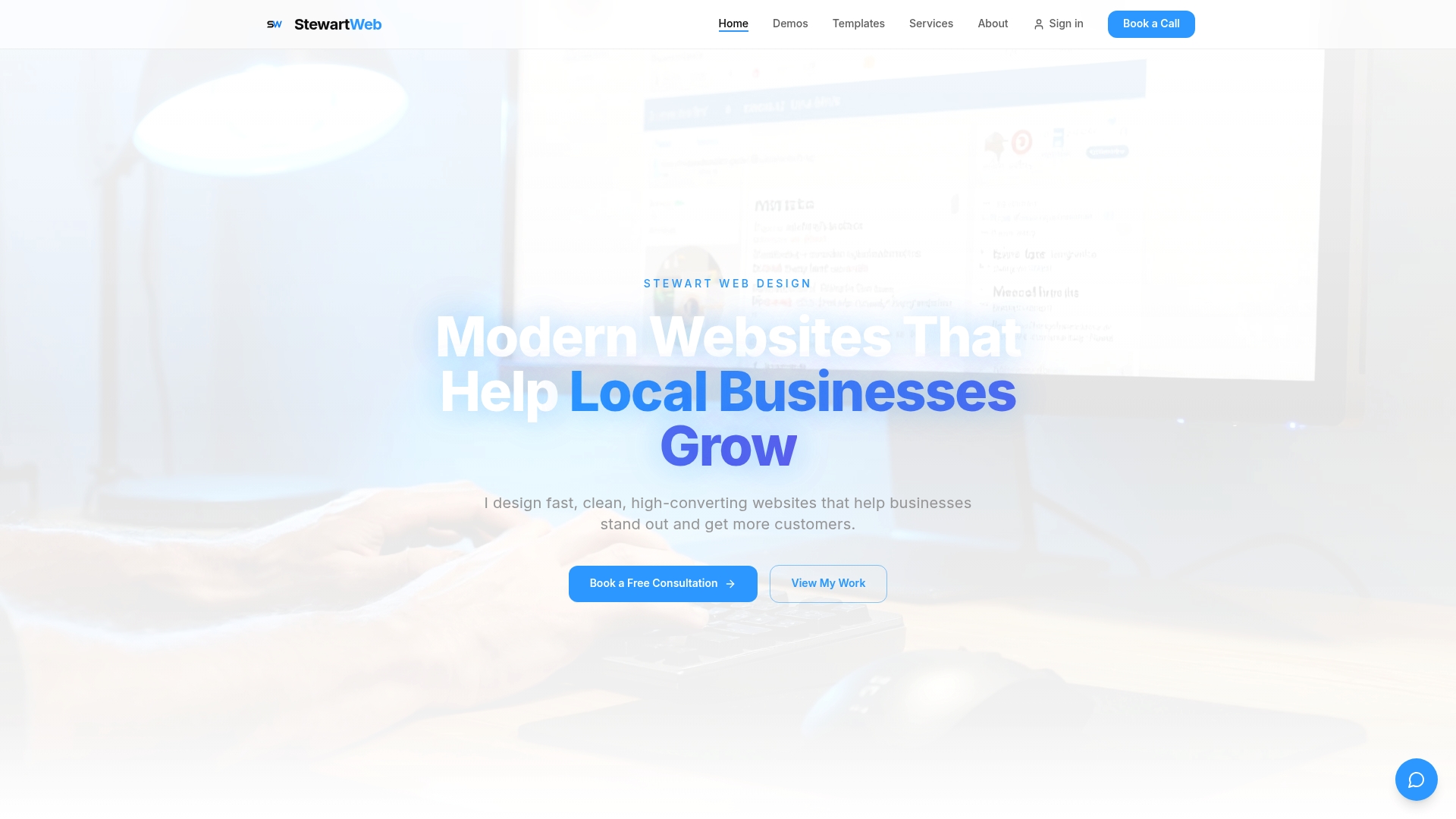
Running a fitness business in 2026 means competing for attention online before you ever compete on the gym floor. Your website is often the first impression a potential client gets, and if it's slow, confusing, or hard to navigate, they'll leave before they even see your class schedule. The good news? Smart, focused web design can turn casual visitors into paying members. In this article, I'll walk you through the most effective fitness website design tips, backed by real data, to help you build a site that works as hard as your clients do.
Table of Contents
- Set a solid foundation: Speed, navigation, and layout essentials
- Optimize calls to action: Make every click count
- Boost engagement: Live chat and interactive features
- Design for everyone: Accessibility and adaptive user experience
- Our perspective: Why less is often more in fitness web design
- Ready to transform your fitness website?
- Frequently asked questions
Key Takeaways
| Point | Details |
|---|---|
| Prioritize fast load times | Websites that load in under 3 seconds retain more fitness clients. |
| Use clear, focused CTAs | One bold action per page helps guide users without overwhelming them. |
| Enable easy engagement | Live chat and interactive features can dramatically increase conversions. |
| Design for accessibility | High-contrast and adaptive design ensures all fitness levels can navigate easily. |
Set a solid foundation: Speed, navigation, and layout essentials
Before you think about colors, fonts, or fancy animations, you need to get the basics right. A fitness website that loads slowly or confuses visitors will cost you clients, plain and simple. These foundational elements are non-negotiable if you want your site to perform.
Speed is everything. Page load times under 3 seconds are critical for keeping visitors on your site. Even a one-second delay can cause a measurable drop in conversions. Think about it from your client's perspective: if your site takes five seconds to load, they've already moved on to a competitor.
Here's what you need to prioritize for a fast, clean site:
- Compress all images before uploading them
- Use a reliable, fast hosting provider
- Minimize the number of third-party plugins or scripts
- Enable browser caching so returning visitors load your site faster
- Test your site speed regularly using free tools like Google PageSpeed Insights
Navigation matters just as much. Simplified navigation with 5-7 top-level items consistently boosts conversion rates. When visitors land on your site, they should instantly know where to go. Too many menu options create confusion. Keep it clean: Home, Classes, Pricing, About, and Book Now is a solid starting structure.
Layout is the third pillar. Research on how people read web pages shows they follow an F-pattern, scanning across the top and then down the left side. Place your most important content, like your headline and primary call to action, in those zones. This isn't guesswork; it's how real users interact with pages.
Building custom website foundations with these principles baked in from the start saves you from costly redesigns later. Get the structure right, and everything else becomes easier.
Pro Tip: Run your current site through Google PageSpeed Insights and ask three real clients to find your booking page without help. Their experience will tell you more than any analytics tool.
Optimize calls to action: Make every click count
Once your site's basics are dialed in, focus on turning visitor interest into action through purposeful calls to action. A call to action, or CTA, is any button or link that asks a visitor to do something specific. And for fitness businesses, getting this right is the difference between a browser and a buyer.
The most common mistake I see is giving visitors too many choices. When someone lands on your homepage and sees five different buttons asking them to do five different things, they freeze. Psychologists call this choice overload, and it kills conversions. Pick one primary CTA per page and make it impossible to miss.
"Focusing on a single key action per page removes friction and guides visitors toward the outcome you actually want." This is one of the most consistent findings in call-to-action strategies for gym websites.
Here's how to build CTAs that actually convert:
- Use action-first language: "Book Your Free Trial" beats "Learn More" every time
- Prominent, contrasting CTAs in red or orange colors have been shown to increase conversions compared to neutral tones
- Place your primary CTA above the fold, meaning visible without scrolling
- Repeat the CTA at the bottom of long pages so visitors don't have to scroll back up
- Keep button text short, five words or fewer
Think of your homepage like a personal training session. You wouldn't give a new client ten different exercises and say "pick what you feel like." You'd give them a focused plan. Your website should do the same.
Building effective fitness CTAs into a clean layout is something I design specifically for fitness businesses. When the button is bold, the message is clear, and the placement is strategic, your conversion rate reflects it.
Pro Tip: A/B test two versions of your CTA button color. Run each version for two weeks and compare how many people clicked through to your booking page. Small changes in color and copy can produce surprisingly big results.
Boost engagement: Live chat and interactive features
With core actions mapped, it's time to make your site truly interactive and responsive to client needs. A static website that just displays information is a missed opportunity. Today's fitness clients expect to get answers fast, and interactive features deliver exactly that.
Here's why this matters: live chat boosts conversion rates significantly for fitness businesses. When a potential client has a quick question about your class schedule or membership pricing, they want an answer right now. If they can't get it, they leave. Live chat keeps them on your site and moves them closer to signing up.
"The gyms that win online are the ones that make it effortless for visitors to get answers and take the next step without ever picking up the phone."
Here are four interactive features worth adding to your fitness website:
- Live chat widget: Use tools like Tidio or Intercom to answer questions in real time. Even a chatbot that handles common questions after hours can dramatically reduce drop-offs.
- Online class scheduling widget: Let clients browse, book, and even cancel classes directly from your site. This reduces friction and saves your staff time on the phone.
- Automated FAQ section: Address the top five questions you get asked every week. Pricing, class types, trial offers, and location details should all be answered before a visitor even has to ask.
- Progress tracking or goal-setting tools: For more advanced sites, interactive tools that let users set fitness goals or track progress create a sense of investment before they've even walked through your door.
Adding interactive web features like these doesn't have to be complicated or expensive. The right setup can be clean, fast, and mobile-friendly, which is exactly how I build them.

Design for everyone: Accessibility and adaptive user experience
Taking engagement further means ensuring your entire audience can participate, regardless of fitness level or ability. Accessibility is not just a legal consideration; it's a smart business move. If parts of your site are hard to use for certain visitors, you're leaving clients and revenue on the table.
Adaptive UI for diverse fitness levels, including high-contrast visuals and voice-guided navigation, is increasingly recognized as essential for fitness platforms that serve a broad audience. A beginner who is nervous about joining a gym needs a different experience than a competitive athlete looking for advanced programming details.
Here's a quick-reference table to guide your accessibility planning:
| Feature | Why it matters | Recommended tool |
|---|---|---|
| High-contrast color scheme | Improves readability for low-vision users | WebAIM Contrast Checker |
| Keyboard navigation support | Helps users who can't use a mouse | Manual testing + axe DevTools |
| Alt text on all images | Enables screen readers to describe visuals | Built into most CMS platforms |
| Voice-guided navigation | Supports hands-free browsing | ARIA labels in your site code |
| Progressive feature layering | Keeps beginners from feeling overwhelmed | Content hierarchy in your layout |
Beyond the technical side, think about your content structure. New clients should land on simple, welcoming pages with clear next steps. More experienced visitors can access detailed program breakdowns, nutrition guides, or advanced booking options through secondary navigation. This layered approach keeps everyone engaged without overwhelming anyone.
Building accessible design solutions into your fitness website from the start is far easier than retrofitting them later. It also signals to every visitor that your gym is welcoming and inclusive, which is a powerful message.
Our perspective: Why less is often more in fitness web design
After years of designing websites for fitness businesses, I've seen one pattern repeat itself constantly: the owners who try to pack everything into their homepage get the worst results. More features, more text, more buttons. It feels like thoroughness, but visitors experience it as noise.
The fitness businesses that consistently convert the best share one trait: clarity. They know exactly who they're talking to, what action they want that person to take, and they design every element to support that single outcome. Nothing extra. Nothing distracting.
I've watched gym owners add a live chat widget, a video background, a class calendar, a testimonial slider, and a pop-up offer all to the same homepage, and then wonder why their bounce rate climbed. The answer is always the same: too much at once overwhelms people.
My honest advice? Start with one clear CTA, fast load times, and simple navigation. Then test. Then add one feature at a time and measure the impact. This approach, informed by real industry expert views, consistently outperforms the "throw everything at the wall" strategy. My expert perspective on web design is simple: focused sites win.
Ready to transform your fitness website?
You've seen the strategies. Now it's time to put them into practice with a website built specifically for your fitness business.
I build custom fitness website design solutions for gyms, personal trainers, and fitness studios that are fast, clean, and built to convert. From smart CTA placement to live chat integration and accessible layouts, every site I create is designed with your clients and your goals in mind. You can be live within 24 hours, with unlimited revisions and ongoing support included. Book a free consultation today and let's build something your clients will love from the moment they land on your page.
Frequently asked questions
What is the ideal navigation menu structure for a fitness website?
Use 5-7 top-level items to keep your menu clean and easy to scan. Fewer choices help visitors find what they need faster, which directly improves your conversion rate.
How can I make my fitness website accessible to all users?
Focus on high-contrast colors and voice-guided navigation, plus keyboard-friendly features. These changes make your site usable for a wider audience and reflect well on your brand.
Do live chat tools really increase sign-ups for gyms?
Yes. Live chat boosts conversions significantly by keeping potential clients engaged and answering their questions before they leave your site.
What's the best color for booking buttons on a fitness website?
Red or orange booking buttons tend to attract more clicks and drive higher conversions compared to neutral or muted tones. Make the button bold and the text short.